Thursday, December 29, 2011

Three Finished Pieces


Above are my three final images which I have drawn over Christmas break.

I started by drawing the glass and grapes on a quilt which I had set up, To draw these objects I used a scribbling type of technique where I would scribble a number of possible lines and then pick the one which I felt best matched the actual objects and then work on it. This technique wasn't time consuming, it gave me a simple sketch of the composition which I could then add more detail to. This drawing took around 40 minutes to complete, the main issues I came across whilst drawing was trying to make the grapes and quilt look realistic.

The second drawing I did is of a fountain with three angels on top, the fountain is in the "Churchill Memorial Park" in Jersey CI. For this drawing I used a very soft 6b pencil which I believe worked mainly to my advantage as it was much easier to draw the fountain due to the shades available, The one problem I found using it is that mistakes are much more difficult to put right as it is hard to erase if the line was too dark. To draw the image I used the angle at which the objects were facing or positioned and then drew multiple lines to first outline and then shade them in that given direction. By using this styles it makes it obvious to the viewer’s where the objects turn, curve and or separate. To draw the water I simply drew horizontal lines which are slightly wavy to try to show the ripples and then only slightly shaded some areas where less light was reflected.

The third and final drawing is of a statue of the devil and is found at "the devils hole" in Jersey CI, I believe that this is was a good example of a muscular person and although it is not exactly a life drawing the statue would have the same proportions as an actual person so we can easily relate to it. I found that drawing the main torso and legs of the statue was quite simple and straight forward as they contained a lot of budged and obvious muscles, the two main parts which I struggled on and still could not correct after various attempts were its face and right hand. I've also noticed that the balance of the model/statue in the drawing is slightly leaning backwards which would be an improbable standing position as he would simply fall over.

Tuesday, December 20, 2011

Week 12 Life Drawing & Basic Human Anatomy: Posture & Pose, Balance, Weight and Gesture


This week we are drawing a life model mainly to get the concept of balance in drawings and models. To successfully do this we must determine the subject’s centre of gravity and then match it within the drawing.

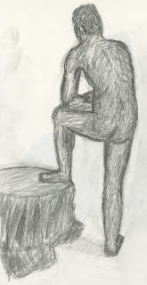
The first drawing on the left is of a model resting his foot on a table, from this drawing we can see that the models centre of gravity is slightly to the left of his right foot. This works as it is clear that the models weight is slightly to the left and that he is compensating for this by leaning his elbow on his thigh and his foot on the table to try to equalize the spread of weight on his feet.

The second drawing of the model sitting on a quilt uses the same technique as the first, from this drawing we can see that the his centre of gravity passes over his right foot from his shoulder level, although it is not obvious from the drawing he is also slightly leaning back and using his right arm to balance. I believe that my drawing of the model has the body at the right angles although its proportions are slightly off which gives the image an unusual look.

Thursday, December 8, 2011

Week 11 Life Drawing & Basic Anatomy: Musculature


This week we concentrated on the muscular structure of the human body by using a life model. The male life model took various postures which put some strain on his muscles, from this strain it was much easier to see and therefore draw the muscle structure of his body.

The first drawing is of the model stretching by pushing on his back; from this pose I could easily draw the muscles along his arms and upper torso. To draw these I used a soft pencil but kept it quite simple compared to my previous life drawings. By keeping it relatively simple, only the main features and then adding more detail to show the muscles mainly with multiple eclipses to show dept.

The second drawing of the model resting his arm on a coat hanger is mainly of the upper torso as it is a relaxed pose so the muscles are more discreet and harder to determine. This drawing is particularly good to show the bicep, deltoid and trapezius muscles as they are being budged from the position of the arm. For this drawing I've also kept the style quite simple although I found it difficult to draw the chest and stomach due to the pose and the angle at which it was drawn.

The final drawing is of the models leg. I've done this using a more detailed style to easily show the calve and shin muscles. To draw the muscles I've simply drawn the basic shapes and features and then shaded into and around them. By using this technique I found that the drawing looked more realistic and that the muscles where much easier to determine. The one piece of this drawing that I dislike is the two curved lines that run along the foot. These lines are too dark as they make a new feature which in reality is not there.

Week 10 Life Drawing & Basic Human Anatomy: Movement


This week our theme was movement so I started by drawing some 10min sketches of the model as he took various poses. The first drawing shown above of the model twisting around shows allot of movement as the figure seems to be very flexible. One reason for this is the twist that the model has posed as it shows many stretch lines and marks along the body which helped to capture his movement and using the loose drawing style of a quick outline and then scribbling the muscles and wrinkles in to get a basic idea of the models form which can then be worked on in greater detail given time.

The second drawing which is on the same image as the first is of the model holding a pole. This was quite an interesting drawing as the model took an attacking stance as if he was going into battle with the pole which gave him an unexpected centre of gravity. If you were to draw a line down the centre of the models torso it would put his centre of gravity slightly to the left, although this looks strange I believe that it is true as the model is simple compensating for the weight of the pole on his right side.

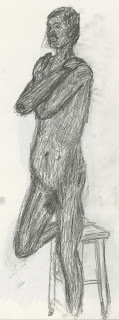
The final drawing in the second image on the right is of the same model resting one leg on a stool. This drawing also uses the loose scribbling technique as the previous two drawing but due to the five extra minutes given for this particular pose allowed me to add extra detail to the drawing. The centre of gravity for the model in this drawing is just behind the models left leg, I believe that this is due to the fact that he is slightly leaning backwards to rest his right foot on the seat of the stool.

Sunday, November 27, 2011

Week 9 Life Drawing & Basic Human Anatomy: Proportion

This week I had my first life drawing session which was not as awkward as I imagined. After warming up by doing some quick sketches I moved on to single line drawings which are something that I enjoyed and will be a technique for future pieces. 

For the drawing above I used a soft 4b pencil, I started by drawing the main figure using the single line technique which worked well. I then added the stool and table which were both covered by a large quilt. Once I had completed these two objects I then went back to the figure sat on top and added some finer detail for example the pin in her hair which I had not previously noticed. Considering proportions on this drawing I believe that they are quite good since it was one of my first life drawing sessions, The only place where I believe the drawing is out of proportion is the visible thigh as it seems to be much thinner than expected and doesn't contain many natural curves to join to her waist

Wednesday, November 16, 2011

Week 8 Reflective Surfaces - Light, Reflection & Refraction


This week I used pencil to draw a collection of jars, jugs and other objects on a table covered with cloth. The first drawing I did was very basic and did not contain many reflections. The only sign of a reflection is in the glass bottle which shows the table although it does not show any of the other objects within its reflections which takes away any effects of realism.

The second drawing is from the opposite side of the table. I had 40 minutes for this drawing and as you can see I did not finish the detailing on the clothe that been placed over the table as there are some blank areas. This drawing contains many reflections since I tried to apply them to every solid and shiny object. Some good examples of these reflections are on the rim of the jug on the left and below the water line of the bottle. To show these reflections I simply shaded the reflections into the objects and for the larger reflections used cross hatching to maintain the shape of the original object so they look realistic.

Week 7 Drawing Soft and Hard Textures

Here I started by drawing a large water vase which had a shiny but worn metal surface. This drawing was done using a charcoal stick to create the darkest and most obvious details. Once these marks had been applied I then smudged the charcoal into the general shape adding more for shadows and reflections. Finally I used a rubber to clean up the image. Since the vase itself is made from what I believe was copper it was a very hard surface, for this surface I used the charcoal to create a bold image. This makes the vase the main object in the picture as it helps it to stand out. The cloth that the vase is sitting on was very soft so I kept it very light and only used a lot of charcoal on the main creases. I then smudged the charcoal to show more of a 3d curve to the flow of the cloth and by using this method it gets rid of the simple single lines.

The second image of a collection of jars, jugs and other object on cloth was also done using charcoal. This image is a good representation of hard and soft textures as you can see that the cloth surface that the objects lye on is light and looks flexible due to the transparency I have given it. On the other hand the solid jugs and other objects have hardly any transparency unless they are made with a transparent material like the glass jar (glass). I found that achieving this effect wasn't as difficult as I first imagined as it was simply a case of the pressure applied to certain areas of the image to make it darker and then smudging those areas to create lighter and more transparent marks. By using this method for the whole drawing I believe it worked quite well as the solid objects seem to dominate the drawing.

Week 6 Still Life: Natural and Man Made Forms


For natural and manmade form we drew a vase of flowers and a single flower on a dressed table. The first attempt I had was too detailed so I only had the vase finished. This drawing was out of perspective and too complicated to easily finish. After learning that planning is key to drawing mainly natural objects, I slowly started to improve as you can see from the three separate drawings above.

The third drawing is mainly planning as there isn't a lot of detail although it is a recognizable picture, in the second drawing the same method was used and once I had planned the composition I started to add more detail to get the resulting image. Finally for the first image I combined the two methods of planning and then working from drawings two and three and then used a rubber to get rid of any unwanted planning lines to clear up and clean the drawing. 
After this week I've found it a lot easier to put pencil to paper and draw most objects simply because I can plan it quickly and if it’s wrong it’s a lot easier to change.

Week 5 Natural Landscapes & Impressionistic Techniques (Directed Study)

(Directed Study)
 
For reading week our directed study topic was natural landscapes & impressionistic techniques. For this topic I drew a landscape which I could see from my accommodation of a large building covering the horizon. Although this drawing doesn't contain a lot of detail I still feel that it is a good drawing and the fact that I was quite a distance away whilst drawing it would explain any lack of detail. To try to make the buildings look as 3d as possible I simple sketched the shading to match the angle of the given object,  when this technique was then matched with another object it give quite a strong or suttle 3d effect depending on how light or dark the drawing is.

Friday, October 21, 2011

Week 4 Light & Shadow


This week’s topic was light & shadow so we drew a cloth/sheet which was thrown over a table and chairs. This composition created some really interesting creases and with the lights some deep and light shadows.
 To start I drew the sheet from the side with most of the crinkles on it and spent 15 minutes. From this drawing I found that some of the shadows I had drawn were too dark compared to the smoother areas on the sheet. After that drawing I spent another 15 minutes on another section of sheet but made the shadows shallower and in some cases wider to try and spread the gradient covering the drawing.
For the final image I combined both these subtle shadows with the bolder and more effective ones to form an images which looks extremely similar to the actual composition and included all the details e.g. chairs tables. Which weren't visible in the previous drawings, this did come at a cost due to the fact that I spent 30 minutes drawing it compared to the previous 15.

Week 3 Composition


This week’s topic is composition so I made some drawing of objects which crossed over each other at different distances. The first drawing is through a window looking at some supporting beams and then the front of the building. This drawing has a lot of detail which improves its appearance. The one thing I found difficult whilst drawing this was showing the glass plain without ruining the other objects. 

 The second image is of a railing, a support beam with lights on it and then the back wall with its windows which I found difficult to keep square. Drawing the lights that sit on the beam were at first very time consuming so I took a simple approach by reducing the amount of detail, since the lights in the drawing are so small this change is almost indistinguishable.
The last image was my first attempt which looks good but it only included two main objects, a hanging star and then another beam, although this wasn't a complicated image to draw the amount of detail on the star made me put it to one side and start from fresh. By drawing compositions like these I gained more knowledge on the depth of field and how the objects appear to of shrunk the further away they are.

Week 2 Perspective


(Directed Study)

                                                                                             (Directed Study)
 
This week I have concentrated on perspective which is something that should be used in any observational drawing as without the right perspective the drawing will look nothing like the actual thing. To start I drew a large building in two point perspective which is situated behind the Horton building at Uni. I felt that this drawing didn't look right, simply due to the proportions of the roof and that some horizontal lines were parallel and therefore didn't have a vanishing point which in turn gave the drawing no constant perspective which made it look unusual.

Once I stopped this drawing I moved on to a small bollard (Directed Study) to practice which helped, although it is quite a simple drawing it still uses the same techniques when drawn as a building or any other complicated object would. After completing the bollard and grasping the main concept of a perspective drawing I then moved on to another building.

This building is one which I can easily see from my accomadation which I drew for directed study. Instead of the drawings perspective coming from ground level it is a few floors up which gives it quite an unusual look. To draw this image I first put some perspective lines in a d then started with the closest point on the building which was the front edge of the building. Once this edge had been drawn and the angles were sketched onto the page I found it quite simple to finish the rest of the building.

Week 1 Basic marks on paper


To start I drew some basic shapes and marks on a sheet of A3 which you can see above. These shapes and marks consisted of dots, lines and curves. The point of this exercise was simply to learn and make sure that I was holding the pencil correctly so it would be much easier to get straighter and finer lines on drawings in the future.

Then I moved on to some basic shading by drawing boxes and then creating a gradient from one corner or side to the other by applying pressure to the tip of the pencil. These gradients seemed to work well so I then drew a circle and shaded it to give the effect of a sphere. To do this I first started shading vertically with curved lines to give the basic shape which worked well. Once I had shaded the object in one direction I decided to add horizontal lines to form a cross hatched shading which I believe significantly improved the look of the object.

The final sketch is of a box placed on a round table. This sketch was mainly to use shading to show how the different sides of the box react to direct light and how the scenes shadow is casted on the floor. By drawing this I could use the technique of holding the pencil to draw the basic shape of the scene and then the shading techniques to show the effect that the light has on the object. I believe that this is quite a basic sketch which easily shows how the objects have absorbed the direct light.